|
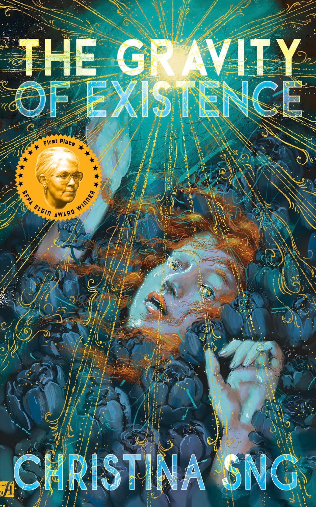
A collection of tiny terrors from three-time Bram Stoker Award winner Christina Sng. The 2024 Elgin Award-winning The Gravity of Existence is a weight lifted, a monster freed, a princess with sneakers, a spell for a better world. From one of the leading voices in dark verse, this collection delights in the misunderstood, putting a new spin on werewolves, basilisks, sirens, ghosts, aliens, pandemics, fairy tales and myths. Sng gives new voice to classic heroines and the result is terrifying, magical, and fantastic. On sale at Amazon. ~ ~ ~ ~ ~ ~ ~ ~ ~ ~ ~ CONNECT: Facebook
My Patreon page features sneak peeks at works-in-progress, behind-the-scenes thoughts on my work, poems, art, haiku, plus signed limited cards and postcard poems to collect via snail mail! If you'd like to support me on Patreon, do stop by and drop me some coin.
~ ~ ~ ~ ~ ~ ~ ~ ~ ~ ~ Last updated: 18 Feb 2026 ~ ~ ~ ~ ~ ~ ~ ~ ~ ~ ~ Christina Sng è stata vincitrice per ben tre volte del Bram Stoker Award. Il suo versificare, apparentemente semplice, accompagna il lettore con un incedere ritmico, cadenzato, a tratti mellifluo. Un sinuoso procedere dentro uno strano mondo. È il luogo dove giace nascosta un'etica segreta, o forse un'inespressa speranza, una lunga catarsi, un percorso di rigenerazione, di scalfittura, di abrasione. Ciò che viviamo leggendo le poesie di Sng è la messa in scena della vendetta contro il mondo della nostra quotidianità cui assistiamo ogni giorno, dell'orrore banale, insensato e doloroso. Acquista l'ebook: Kipple
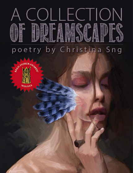
~ ~ ~ ~ ~ ~ ~ ~ ~ ~ ~ 2020 Bram Stoker Award® winner, 2021 Elgin Award runner-up, and 2020 Ladies of Horror Fiction Award nominee, A Collection of Dreamscapes brings to life dark mythologies, fairy tales, a league of monsters, and a journey into the unfathomable depths of the human heart. This widely lauded follow-up to Sng's Bram Stoker award-winning volume, A Collection of Nightmares, has been described by reviewers as "a captivating collection that is not to be missed", "immersive, creepy, accessible", "a dream, dark and fantastic", "haunting, stunning, and poignant", and "a poetry collection every public library should own". Available from Raw Dog Screaming Press and Amazon.
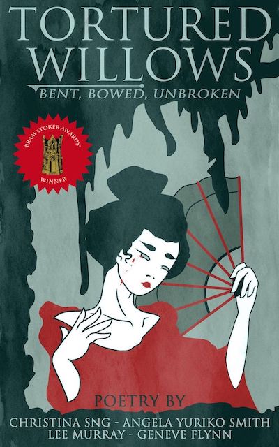
~ ~ ~ ~ ~ ~ ~ ~ ~ ~ ~ In 2021 Bram Stoker Award® winner and 2022 Elgin runner-up Tortured Willows, four Southeast Asian women writers of horror expand on the exploration of otherness begun with the Bram Stoker Award-winning anthology Black Cranes: Tales of Unquiet Women. Like the willow, women have bent and bowed under the expectations and duty heaped upon them. Like the willow, they endure and refuse to break. With exquisite poetry, Christina Sng, Angela Yuriko Smith, Lee Murray, and Geneve Flynn invite you to sit beneath the tortured willow's gravid branches and listen to the uneasy shiver of its leaves. Available from Amazon.
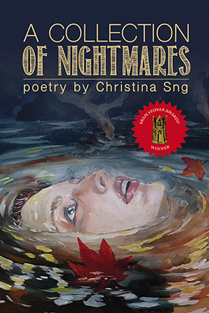
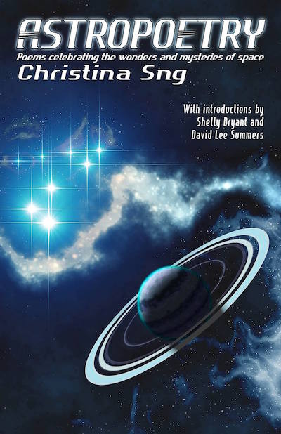
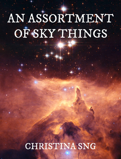
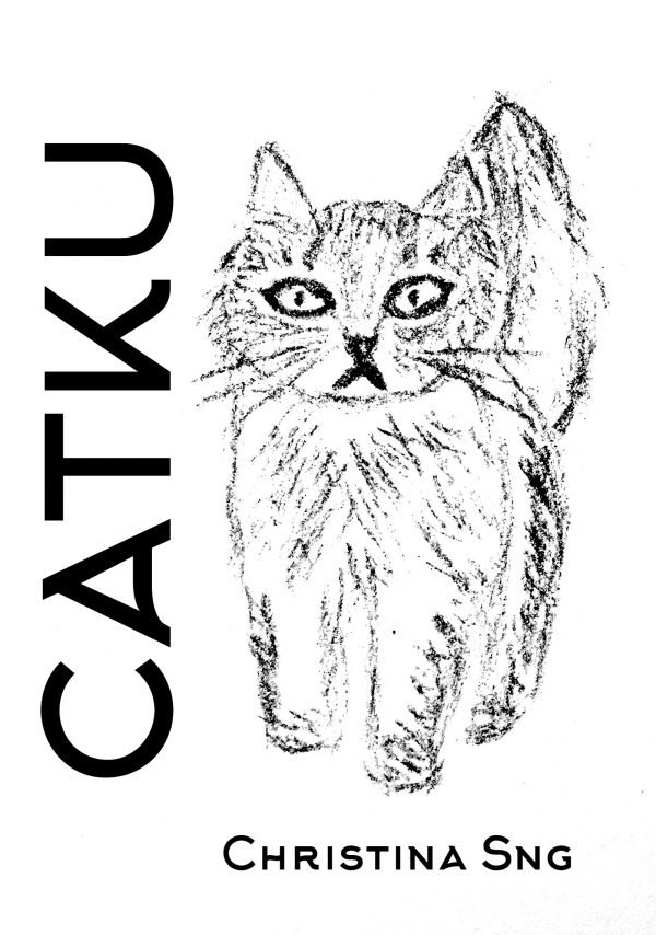
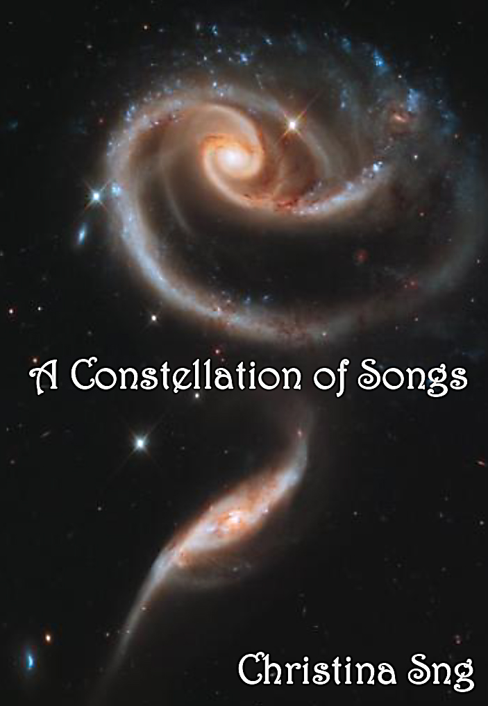
2017 Bram Stoker Award® winner, 2018 Elgin Award nominee, and one of LitReactor's Best Books of 2017, A Collection of Nightmares (Raw Dog Screaming Press) features a surreal dreamscape of seasonal creatures, bone carvers, listless gods, vengeful angels, post-apocalyptic survivors, and the end of all things good and evil. Available from Amazon and Raw Dog Screaming Press. 2018 Elgin Award runner-up Astropoetry (Alban Lake Publishing) celebrates the wonders and mysteries of space in scifaiku and lyrical prose. On sale from Amazon. 2017 Elgin Award nominee, An Assortment of Sky Things, is a poetic tour of the solar system and beyond in haiku and short poetry. Catku takes us on a whimsical life journey between a cat and its human, a tale woven with 21 haiku and senryu based on my life with beloved cats. A must-have for all cat lovers. A Constellation of Songs, my first haiku collection, spans birth to death, illuminating the wonder and beauty of life in between. Available as a free PDF from the Origami Poems Project.
|
Christina Sng is the three-time Bram Stoker Award® and Elgin Award-winning author of A Collection of Nightmares (2017), A Collection of Dreamscapes (2020), Tortured Willows: Bent, Bowed, Unbroken (2021) with Geneve Flynn, Lee Murray, and Angela Yuriko Smith, The Gravity of Existence (2022), Astropoetry (2017), An Assortment of Sky Things (2016), and haiku chapbooks A Constellation of Songs (2016) and Catku (2016). Her poetry, fiction, essays, and art appear in such venues as Fantastic Stories of the Imagination, Interstellar Flight Magazine, Penumbric, Southwest Review, and The Washington Post, and received many accolades, including the Jane Reichhold International Prize, The Pula Film Festival International Haiku Award, multiple nominations for the Rhysling Awards, the Dwarf Stars, the Pushcart Prize, and the Ladies of Horror Fiction Award, as well as honorable mentions in the Year's Best Fantasy and Horror, and the Best Horror of the Year. Christina was a recipient of the 2021 Ladies of Horror Fiction Writers Grant. Her essay Final Girl: A Life in Horror received a 2020 Bram Stoker nomination for Superior Achievement in Short Non-fiction and her first novelette Fury made its debut in the award-winning anthology Black Cranes: Tales of Unquiet Women (2020). As a Poynter ACES certified editor, Christina has worked with authors in non-fiction, memoir, poetry, and fiction. She is an ardent proponent of the Oxford comma. ~ ~ ~ ~ ~ ~ ~ ~ ~ ~ ~ ~ ~ ~ ~ ~ ~ ~ ~ ~ ~ ~ ~ ~ ~ ~
News | Poetry | Fiction | Art | Non-fiction
~ ~ ~ ~ ~ ~ ~ ~ ~ ~ ~ ~ ~ ~ ~ ~ ~ ~ ~ ~ ~ ~ ~ ~ ~ ~
*
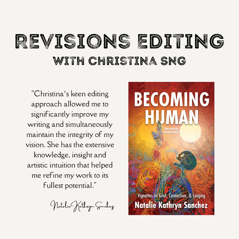
WRITING & EDITING SERVICES"Christina's keen editing approach balances her extensive literary knowledge with an intuitive awareness of the author's vision, giving her clients the opportunity to refine their writing to its fullest potential." ~Natalie Sanchez, author of Becoming Human
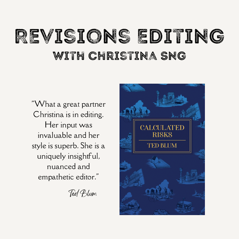
"What a great partner Christina is in editing. Her input was invaluable and her style is superb. She is a uniquely insightful, nuanced and empathetic editor. ~Ted Blum, author of Calculated Risks Writing I write everything: web content, social media posts, articles, essays, technical papers, corporate white papers, and books. Editing I offer copy editing and proofreading for a final polish and review of your work before it goes to publication. If you would like a thorough review, I offer revisions editing. My job is to make your manuscript sing. I'll be looking at flow, style, and readability, and smoothen out any bumps in your writing. While revising to make your language compelling and reworking sentence structure, I am careful to retain your tone and voice. I'll make suggestions throughout your manuscript and it will always be your choice if you want to accept that change. You are in control of your manuscript. My Revisions Process Your manuscript will go through three rounds of revisions with me. This will be a collaborative process that will require your response and input at every stage. 1. The first stage is a read through where I may make initial changes. On your part, you will review those changes and then accept or reject them. 2. In the second stage, I dive deep into each line and propose edits for clarity, consistency, accuracy, and readability, while preserving your unique voice. We will discuss structural issues like reordering chapters for a stronger overall message and ensure your manuscript is cohesive as a whole. You will review each edit and decide if you wish to accept or reject it. 3. The third stage is for you to read your manuscript through your reader's eyes. Is this the experience you want your reader to have? If not, we will revise your manuscript to ensure it is. You have my support and advice throughout this stage. Ask me questions anytime. I will guide you through the process and offer suggestions on structuring and final touch ups.
Ready to jump in? Let's roll up our sleeves and get to work. Email me.
~ ~ ~ ~ ~ ~ ~ ~ ~ ~ ~ ~ ~ ~ ~ ~ ~ ~ ~ ~ ~ ~
FEES (in USD) Writing:
Content Writing: 10-40c/word Editing:
Revisions Editing: 5-6c/word
Note: Word count is calculated based on your manuscript when it is first submitted.
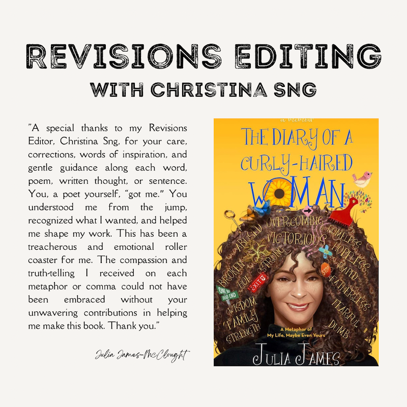
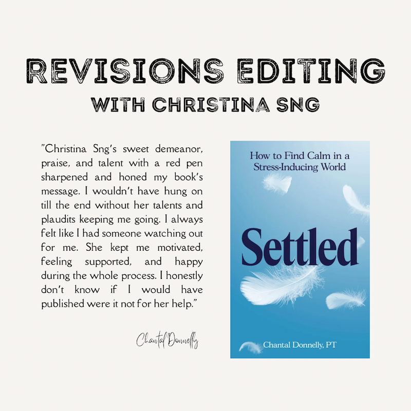
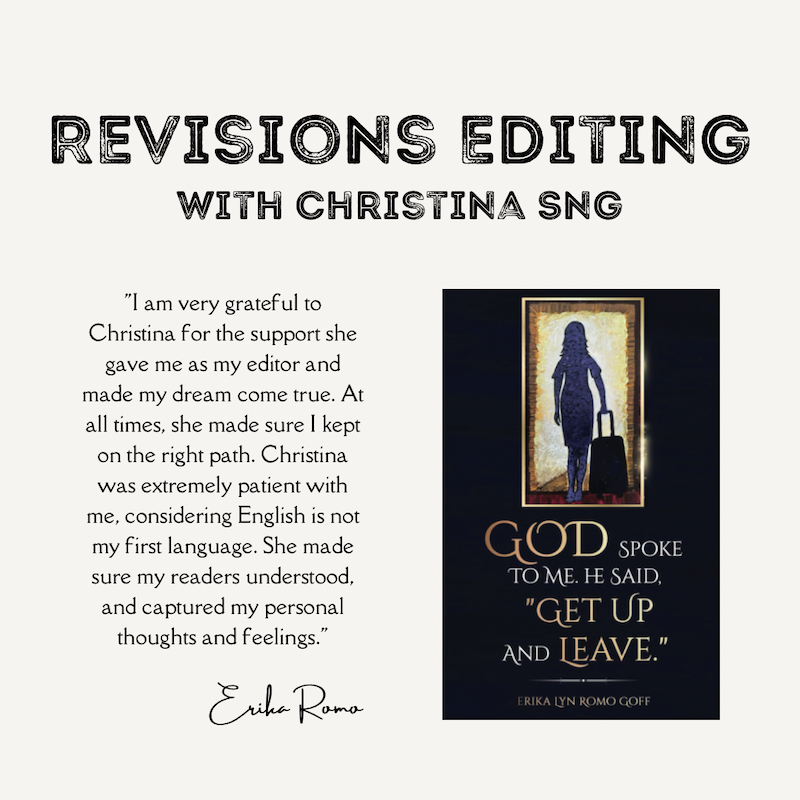
~ ~ ~ ~ ~ ~ ~ ~ ~ ~ ~ ~ ~ ~ ~ ~ ~ ~ ~ ~ ~ ~ REVIEWS Here are a few reviews, shared with author permission.
|